Monday, 21 November 2016

Assignment 2 - Anslysis


Meghan Elizabeth trainer is an American signer, songwriter and record producer. She wrote, recorded, preformed and produced songs called your lips are movin. We see this song on YouTube, television and radio and I will be analysing this song's music video and the album cover. The music video shows it not aimed for classy and older people as the video consists of being fun, lively and enjoyable. Which shows that the target audience is mostly for teenagers. 

There are several costumes in this music video to promote different ways of style to create entertainment and engaged the audience more in the music video. I have picked out 2 outfits that she has worn in this video. The first outfit is a white dress with hints of black in an unusual shape which links to the theme as being quite unexpected and mad. She also wore black boots to complete the outfit and made it look fashionable as boots are in. Thus she also might have worn them as they are comfy where she had to dance around. I feel like the outfit contrasts well with the funky, colourful and busy background. The second outfit was a all black, once again to look good with the background. She wore a simple long sleeved black tank top with a leather skirt. To mix two different materials of the same colour like the different genres she has used to make pop music. And mixing different styles together is in which will catch the audience's attention, which may inspire them as well as being unique and fashionable. 

The earring creates significance as she wore lip shaped earnings connecting it to the theme. The earnings were coloured in a classic red lip colour, which connotes vibrance and standing out of the colour. It works as a great accessory to accent the black and white dress, which will attract many people. The earning looks like a resemblance of pop art relating to the theme. This accessory draws attention to the title connoting casualness, madness and enjoyment. 

The red mic she uses in the first scene represents that she is in power and that she is controlling the music, as the colour red connotes being loud, dramatic and vigorous.  

Her emotion and attitude in the music video fits with the beat and theme as she is represented as a funky, fun, active singer in her performance. Giving direct address has a big influence on the audience, as it creates a better interaction with the artist.  
 
The lighting which s quite high key helps emphasise a happy and more awake mood. There might have been artificial lighting, showing the artist in a more enhanced way.

There are many different types of setting and each of them is a very important part of the video creating a meaning to each scene. The first setting I chose was a very animated background. The colours used were mint blue and white, which connotes an exultant and vivid style. The stripes using those colours give a beach, summer vibe connoting enjoyment, excitement and amusement. These colours and patterns used reflect a good combination with the plain white wall creating an eye catching canvas, especially with the big red lip again to vary the theme. The use of the classic lip colour red is used as it is reconigsable and popular.  

The artist has been represented as a lively, energetic and cheerful signer. In the music video she has not challenged any stereotypes as she has been represented in a girly way. However the men in this video have challenged the stereotypes, as they have been represented in a feminine way. They would wear more feminine coloured and styled clothing and their actions would be more girly creating a funny atmosphere. 

The colour black symbolises night and the way she is dancing and the setting shows
that its a midnight party.

      The music video consists of many different types of camera shots. For example long shots, close ups, mid shots. This is to build focus on the artist, location and the indication of emotion to reflect the words of the song with the movements of artists.  
      The movement of the camera is used to follow and trace the artist. There are many different angles used as well for example high and low to help define the video as you have used a variety of angles engaging the audience. In order to edit a video the main editing technique used is the quick cuts.     
t
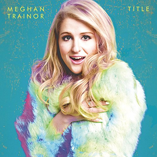
This album cover uses a very unlimited colour pallet for the majority of the cover. The lagoon blue as the background has texture to make it more alive. The costume worn was a white fur coat, which creates a calm, soft and elegant effect. The colours like green and pink on the fur coat connote happiness and excitement. 

This hints us about the representation of the style of the music, which would be pop. The appearance of the image is a vintage. She is represented as a pure, modest and generous women as Meghan trainer’s expressions are amazed, surprised to show how.  She is looking with a direct address to make it look more realistic.

Meghan only wore one accessory; her diamond, sliver ring to not make it over the top but make it a statement peace, to show simplicity and to show that she is also targeting upper class members. 

The font size is a reasonable size to about size 14-16 or maybe less. Though it still catches your eye due to colour and style. The font colour is in green to show similarities and connections between the colours schemes as the colour green is also in the coat. The size is a little spaced out while using capital letters. Connotes sweet and simple.

The lighting isn't dark and it isn't that bright though it varies different kinds of lighting for example on her face is glowier than the rest of the body. The background being dark looks very nice with the lighting being bright on Meghan trainer showing that she is the main focus. Very light and bright making it feel more lively.

There are many conventions in a music video and they are the name of the artist, an image of the artist as well as the name of the album. However this album cover doesn't have a title or the name of the album because it’s making it unique and breaking away from the usual conventions. As they directors of the album cover are trying to tell us that its a surprise and that the models expressions say everything.

There is quite a lot of synergy used between the artists as she has been represented as a fun, happy and person. In both the music video and the album cover they are very bright and colourful. This is used to ensure the audiences know that this is part of the campaign and that it isn't completely different.


Terminology
Media production
Representation


Monday, 24 October 2016

Assignment 1 - Print advert


My fragrance print advert is aimed at females who enjoy a natural and simple theme and also like different bright colours. the ages estimated are 12 to the late 20s. This will appeal to them as for the main colour, green connotes clean, verdant and fresh. The shot was a mid shot not showing all of her body which also adds a good effect,making it look more realistic and at eye level. The focus is on her and the flower to show that the flower and herself most significant and completes the advert, it connotes purity and the use of the plants and the flowers on her dress really gave colour and life to the dress connoting happiness, enjoyment and joy. It matched her prop which was the flower crown to symbolise the same words for example the colour yellow; which means sunshine and the word red means love. The setting is in a small garden to make it look like spring and and show that the perfume is very natural. I chose a particular font for the name "essence" as it was bold but at the same simple and modern and I had a very cursive detailed slogan for"free your sprit ". Thus the dress was very lose, light and easy which represents simplicity and a relaxed mood. The theme of a girl being next to some flowers is quite common but the colours and the name of the product mean and show a different perceptive. I would feature my advert in a teenage store as the model is in that age group, like splash or forever 21 or a on social media.

Tuesday, 18 October 2016

Assignment 1 - Analysis


y


This is an advertisement for a perfume by Taylor Swift, called "Wonderstruck". The advert is targeting women who are interested in fantasies and classy themes that may be around the age of 14 to the late 20s. However the target audience is not limited by these ages since Taylor Swift is modelling and as she is a celebrity it may encourage many to buy the product. Men would be a secondary audience who would buy the product for their partners/daughters.

The background consists of greenery and chandeliers, which I think conveys a narrative of a princess/queen going to a garden. The chandeliers placed in the garden are not realistic but this promotes the theme of fantasy.

Colour is a major role in attracting customers. The main colour of the advert; green connotes nature, health and fresh air. It is used for the whole background with sliver/gold chandeliers contrasting well with the peach colour of the model’s long glamorous, elegant and fashionable gown. The colour of the gown is pleasant to the eyes as it is a gentle and calm colour representing the personality of royal individuals. The earrings worn also reinforce this theme of upper class. On the other hand, the director has used a pop of colour for the perfume bottle to make it stand out. Furthermore, purple is a colour usually associated with royalty.

There are various different types of lighting used in the advert. Behind the model bright lights are used, to draw attention to the model, showing that she is the main part. Due to the model’s fame, putting emphasis on her will attract more people.

In the advert a mid shot is used so that just enough of the model's dress and background can be displayed. The angle of the shot is eye level to make it easier to visualize and make the advert like we are seeing this live.


Taylor swift looks in the camera directly and appears calm which depicts her confidence, supporting feminism. A direct address is used in the advert. The model's facial expressions attract many women towards the advert, as the model may inspire them. The pose of the model persuades the audience to be attracted to the perfume. It looks like the model was captured whilst she was walking towards the perfume, as if the perfume was pulling her towards it. This shows the irresistibility of the perfume.

The use of words “a beginning of something magicalis compliant with the enchanted and magical theme.

The name of the product, Wonderstruck implies that the model was amazed with magical world she entered upon use of the perfume: a world that combines luxury with nature.


This is an advertisement for a perfume called "J'adore" by Dior. For me, the advert indicates a narrative of a women preparing for a party, wearing an outfit matching the decorations of her house. In the advertisement the model, Charlize Theron, has been represented as a women of high status. This suggests that the advert is targeting upper class members of the society, as the major audience or those who aspire to be. The brand of the perfume, Dior: a designer brand further emphasises the target audience. The age group of the model: 25 to 35 thus the target audience is females of this age. However the advert could also be targeted at men, as they may purchase the perfume for their partners or daughters. 

Colour plays a role in attracting potential customers. The main colour used in the whole advert is gold. Gold connotes valuable, elegance, and luxury. The model in the advert is wearing a long and fitted gold dress with sequences. The dress looks fashionable and expensive which displays royalty. The setting is in a modern, golden mansion, which also suggests royalty, as royal individuals live in grand mansions. The chandeliers in the mansion are also gold in colour. I believe the excessive use of gold throughout the advert is to indicate the product is of high value.

In the advert a mid shot is used, so an appropriate amount of the model's dress and mansion can be displayed. The angle of the advert is eye level, to create a realistic image.


There are various different types of lighting used in the advert. Behind the model, high key lighting is used, to draw attention to the model. Low key lighting behind the perfume on the left helps helps the perfume stand out.


Charlize Theron looks in the camera directly and appears relaxed which represents her as a confident, independent and bold woman. A direct address is used in the advert. The model's facial expressions attract many women towards the advert, making them want to like her. 


In the advert, the background is blended, this shows that the significant parts of the advert are the perfume and the model. Hard focus is used on the model's face to suggest the importance of the impact of her facial expressions. 

The text is written in white, making it stand out from the gold colour used. The name of the product "j'adore" is written in a bigger font then the brand name "Dior", to indicate that the primary focus of the advert is the product and the well-known brand of the product is secondary. The product's name is written in a unique style making it eye catching.  

Terminology
Media language
Audience